


A man quenches his thirst on a hot summer day at Connaught Place in New Delhi, April 24, 2022. Photo: PTI/Kamal Singh
- A heatwave is a silent disaster with spatial, temporal and material dynamics – and this means understanding heatwaves can be a complicated affair.
- The most common way of reporting heat in India is based on maximum air temperatures. Another common method uses the land surface temperature.
- We also need to factor in anomalies, level of urbanisation, humidity and the combined effects of the forces that are driving climate change.
- How we measure our heatwaves dictates which aspect of them we react to first. Incomplete measures worsen human health and debilitate the economy.
- One way to raise awareness of heatwaves is to name them – like we name cyclones – based on indices or combination of indices and measures.
This year, India witnessed an early intense heatwave where around a billion people were exposed to temperatures more than 40º C in the month of April itself. But heatwaves are so much more dynamic and complex that traditional methods of reporting them, purely based on absolute air temperatures, might be insufficient.
Heat has spatial and temporal dynamism as well as interacts differently with materials. So its measurement must also be dynamic. And not just the heatwave – its effects have several dimensions as well, with respect to human health, economic activity, etc. It is therefore necessary while measuring a heatwave to use various metrics, indices and methods to get better insights into the spatiotemporal nature of heat.
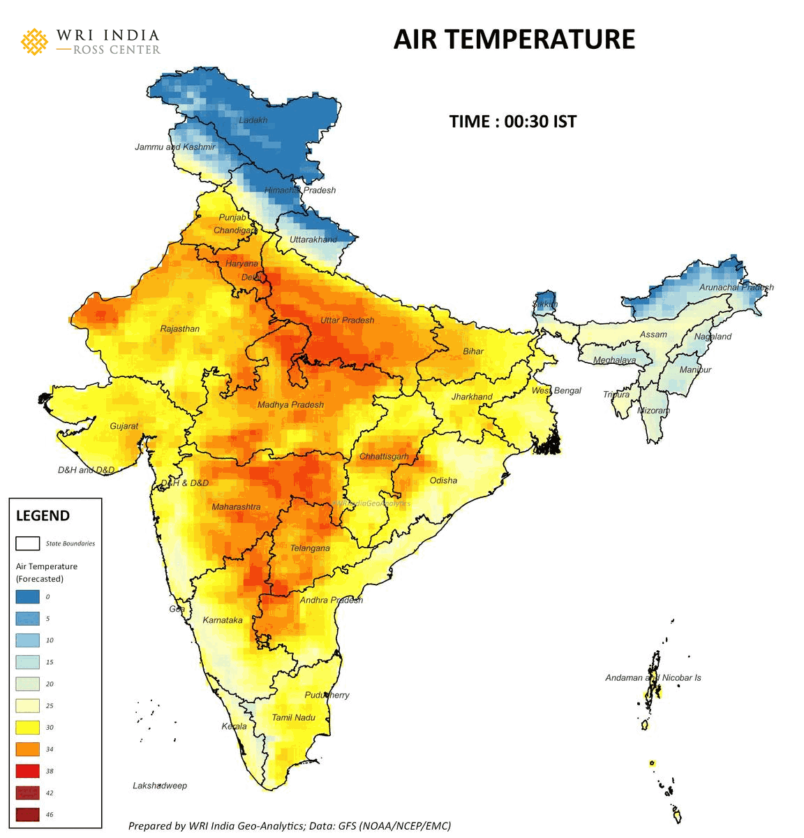
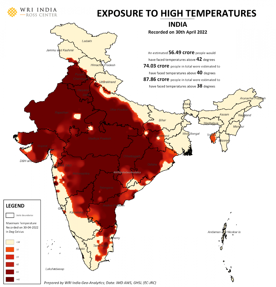
The most common way of reporting heat in India is based on maximum air temperatures. This year, around 82 crore people faced 40º C and 99 crore people faced 38º C on the single day of April 30. These high temperatures did not just impact human health but also affected power consumption patterns.
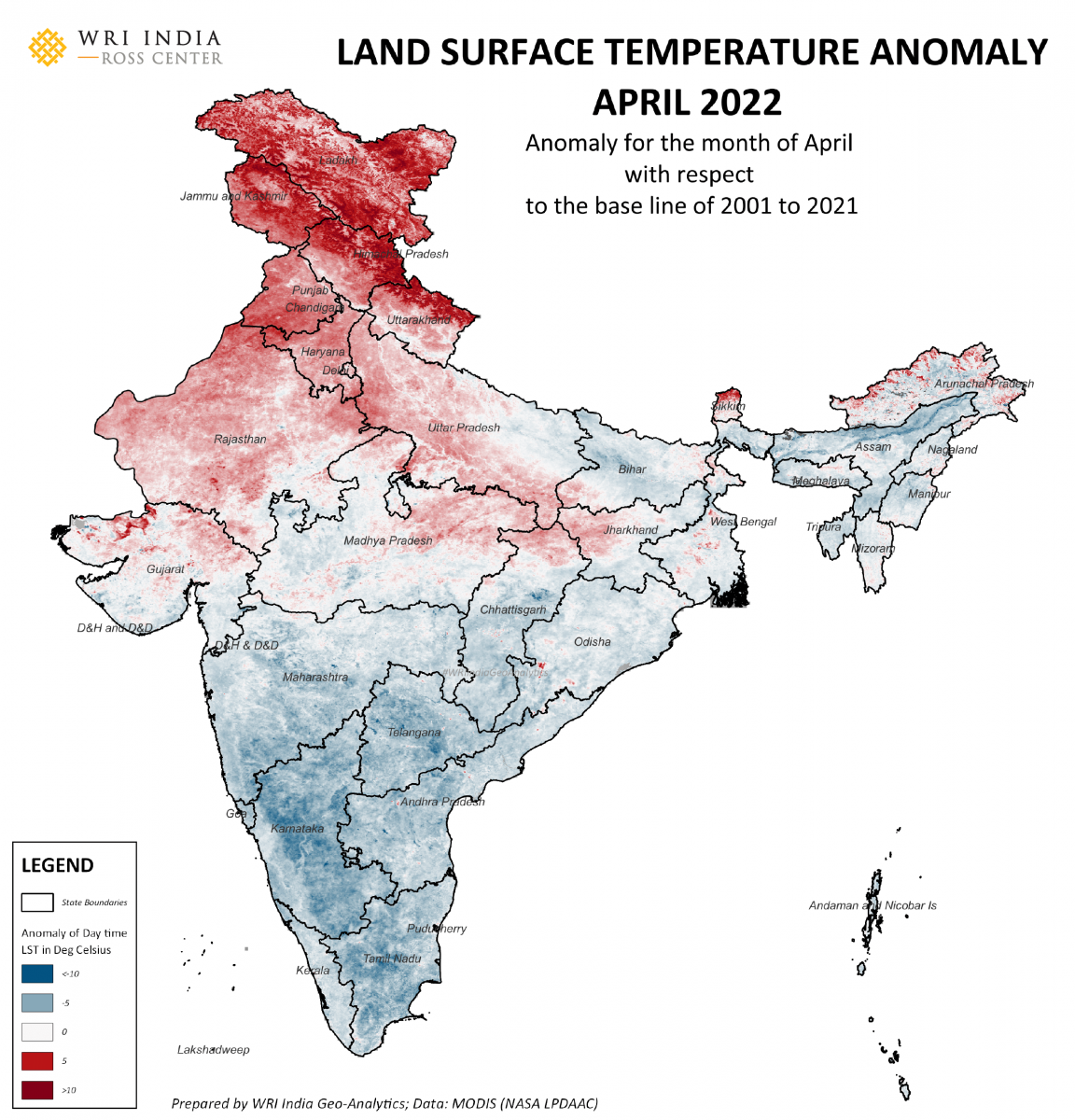
Land surface temperature (LST) is derived from satellite observations. For a specific duration, it provides a wider spatial coverage of heat measurements, which differs from the one based on air-temperature at the time of observation.
LST is a measure of interaction – as it indicates the skin temperature of materials above Earth’s surface. It could be vegetation, types of roofs, tar or pavement materials, water, etc., and is thus useful to understand the urban heat-island effect. For example, even with similar air temperatures, areas with higher green cover will have lower surface temperatures during daytime compared to areas covered in concrete or tar.
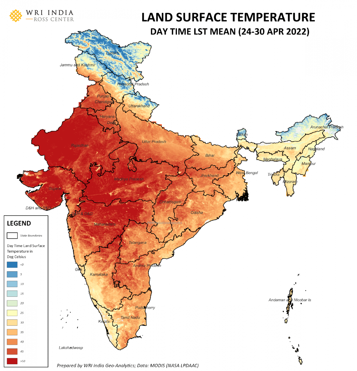
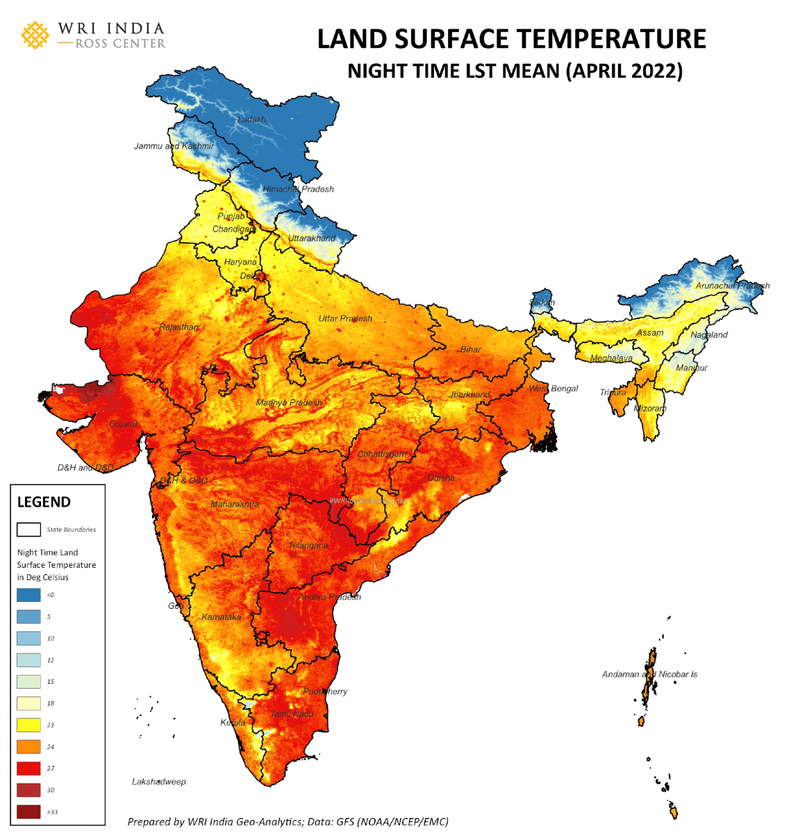
LST measurements depend on the time of day and help to identify urban heat pockets. At night, temperatures observed are different because surfaces like buildings, roads and other urban landforms slowly release the heat absorbed during the day. In the map below, urban centers are visibly hotter because of the urban heat-island effect.
Then there are also anomalies. These are deviation of temperatures from their long-term average and are critical to understand the effects on meteorologically dependent sectors like agriculture, energy, etc.
The term “normal” is used interchangeably with “mean average” in India, leading to the misconception that deviations from mean are not normal. However, note that anomalies are deviations from average, not deviations from normal, even though institutions like the India Meteorological Department (IMD) report them in that manner. So anomalies should not necessarily be considered “abnormal”.
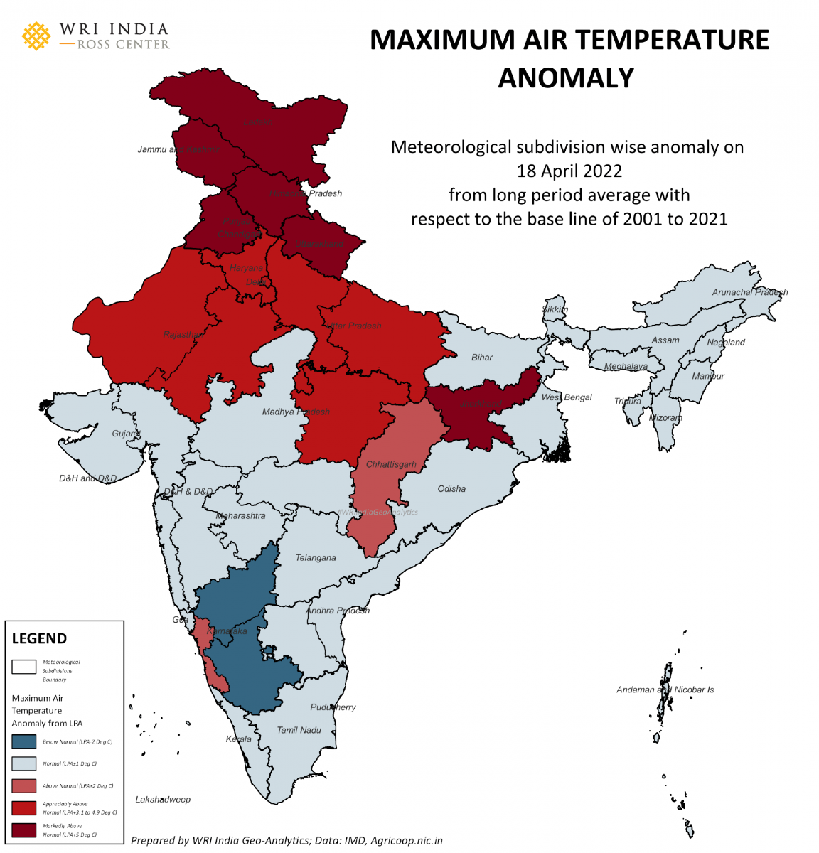
In April this year, meteorological subdivisions in Northern India have not only faced temperatures above their long-period averages but have also clocked them in a prolonged manner, over a month, which can have a profound impact.
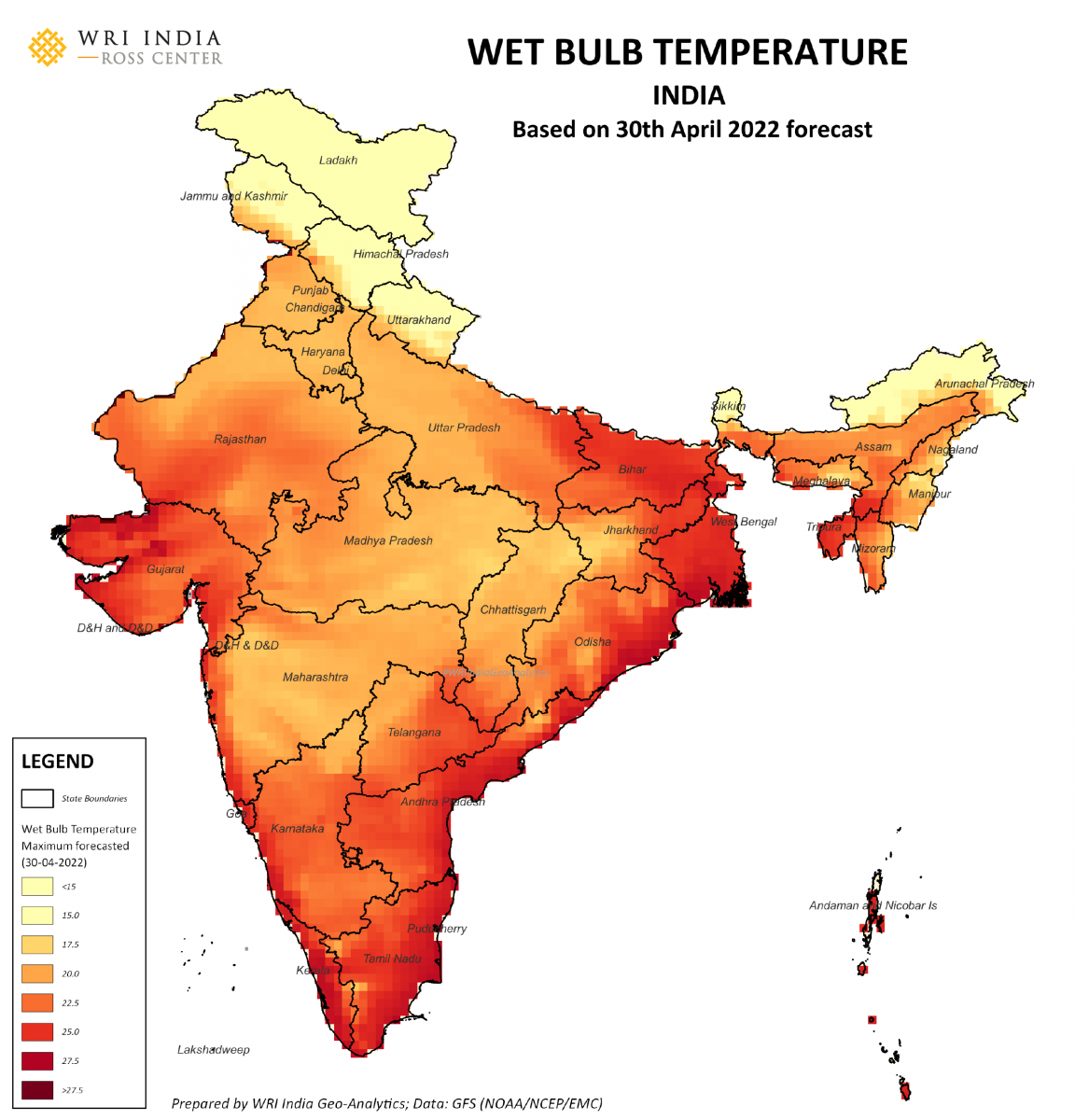
While air temperatures, surface temperatures and their anomalies are powerful indicators of heatwaves, they are still insufficient to explain the proportion of human discomfort or physical stress. Along with temperature, humidity and other factors play a vital role in human well-being.
The wet-bulb temperature takes humidity into account and is defined as the lowest temperature at which air can be cooled by water evaporation at constant pressure. Wet-bulb temperatures are increasingly being used across the world as a measure of thermal discomfort. A forecasted wet-bulb temperature map below shows higher temperatures, particularly in Indian coastal regions with higher humidity.
Also read: As Heat Engulfs North India, Keep an Eye on the Wet-Bulb Temperature
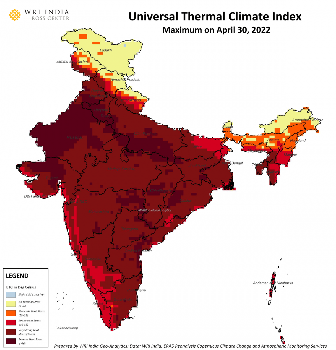
A more robust method to measure thermal discomfort which works universally is Universal Thermal Climate Index (UTCI). It is a human biometeorology parameter used to assess the links between outdoor environment and human well‐being.
Data based on European Centre for Medium-Range Weather Forecasts ReAnalysis 5 (or ERA5), shown in the map below, displays the maximum recorded UTCI. Here, observe that almost all of India is experiencing some form of heat stress, resulting in its widespread impact.
The above measures, indices and anomalies provide detailed insights into heatwaves and their effects. In addition to these, there is one more dimension that plays a critical role: time.
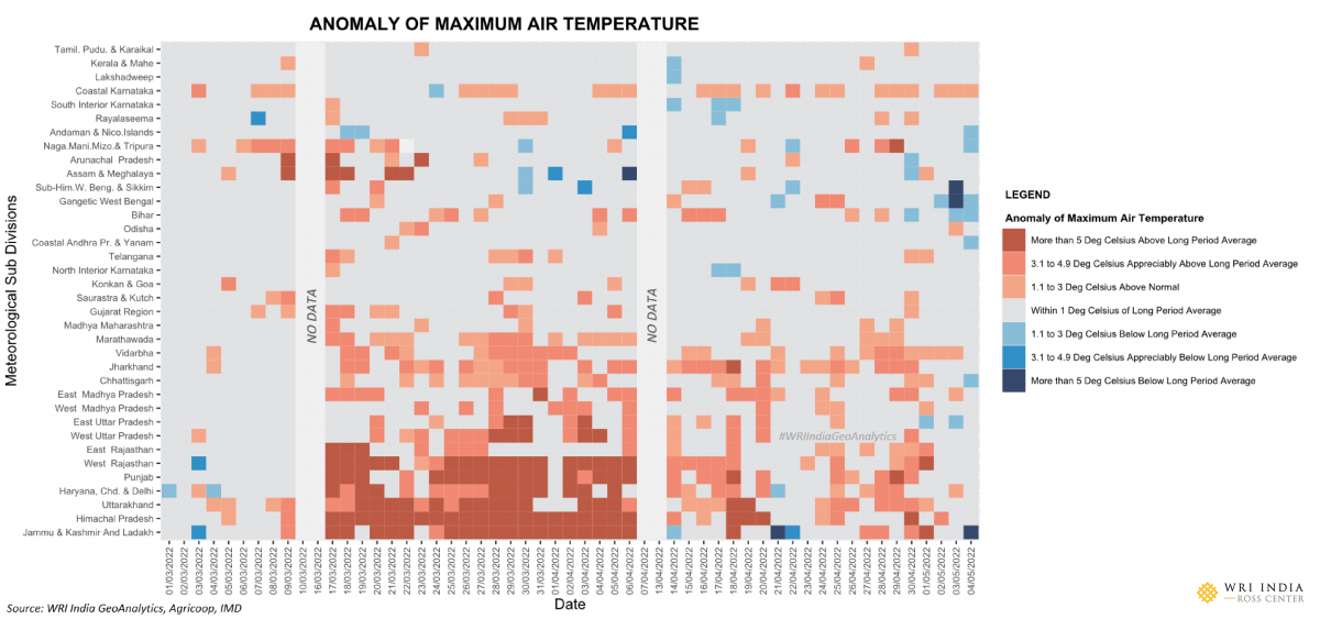
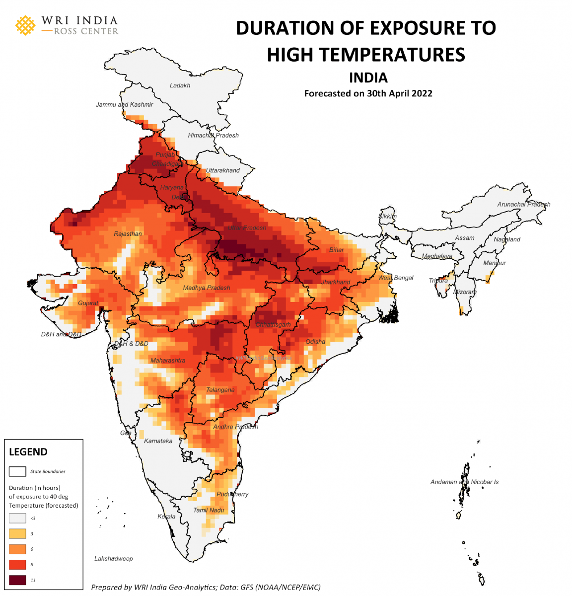
Measures we often use to define heatwaves are based on maximum numbers recorded in a day. But the duration of exposure to higher temperatures or indices varies from place to place and plays a critical role in quantifying heatwaves.
The map below shows the duration of exposure to 40º C in a single day. And it can be seen here that the addition of time as a dimension provides more insights into maps of heat exposure, compared to the maximum air-temperature maps that showed every place to be affected equally.
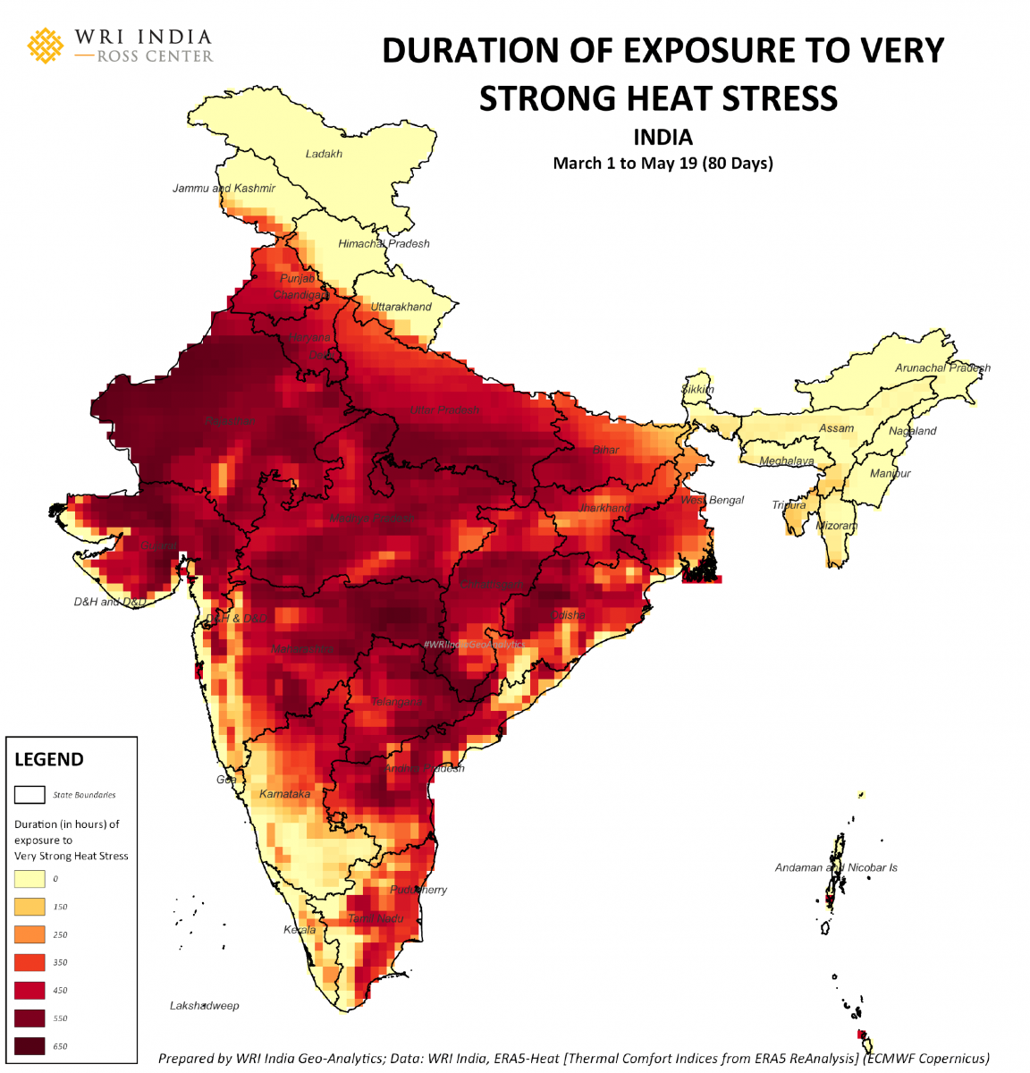
For human beings, prolonged exposure to heat over multiple days is detrimental to health. The map below shows the duration of exposure to strong heat stress in terms of number of hours spread across a span of 80 days in places in North and Central India.
It is estimated from our analysis that 105 crore people faced this high strong heat stress for more than 300 hours, while 132 people crore people faced it for at least one hour in the 80-day period.
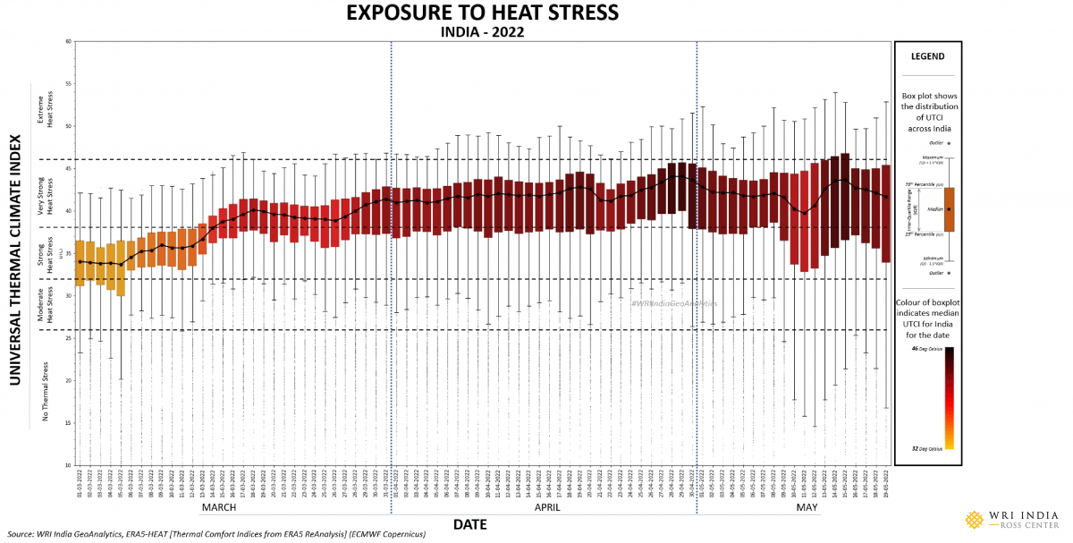
The chart here shows the temporal progression of distribution of daily maximum heat stress in India. Most of the country began experiencing strong and very strong heat stress since March. The entire country remained under a high amount of heat-stress until the arrival of pre-monsoon thunderstorms and Cyclone Asani in some parts of India.
But even after their arrival around 10 May, many regions continued to face acute stress, which can be seen in the spread of bars in the chart.
Between the different measures, indices, anomalies and their temporal nature, we get insights about heat waves and their effects on human well-being – whether they are related directly to health or the economy.
To find the impacts of heatwaves and drive solutions to combat them, we need to have good and reliable data on measures. Although it is possible for us to study large-scale national impacts, it becomes necessary for us to have more spatially and temporally granular weather data for local decision-making. This in turn indicates a need to strengthen our automatic weather station networks across the country.
Unlike other natural disasters, heat is silent and lacks awareness and recognition among the public. One way to raise awareness is to use names for heatwaves and develop detailed advisories based on indices or combination of indices and measures listed above. Cities like Seville in Spain, for example, have started naming heatwaves this year to increase awareness of their effects.
An important reason why we need to strengthen methods of measurement is that heatwaves and their effects are differential in nature. As the LST maps showed, urban areas face higher temperatures than their immediate neighborhoods. Even within urban areas, vegetation is not evenly distributed, and urban forms roofing materials differ. These create wide differences with respect to exposure to heat – and the people’s ability to fight against it is rooted in a range of socio-economic factors.
Maps and data were prepared and processed by Raj Bhagat Palanichamy, Harsha K. (program associate, GeoAnalytics, WRI India), Jyoti (program associate, GeoAnalytics, WRI India). The views expressed here are the author’s own.
This article was originally published on the WRI India – Ross Centre blog and was republished here with permission.