


Photo: fernando zhiminaicela/pixabay.
In response to the COVID-19 outbreak, the research fraternity is assessing several parameters and reported results. These include indicators of transmissibility, severity and others.
Here, we detail our efforts to understand the COVID-19 situation in India using the following measures:
* Standardising measures of infection and its sequelae[footnote]A condition that is the consequence of an infection[/footnote] – Counting the absolute number of tests and infections in states is not helpful for comparison purposes. It is important to note that we don’t know what will be the ultimate prevalence of COVID-19 in the country. In the absence of such reliable forecasts, it’s best to rely on the current aggregate prevalence of 59.8 confirmed cases per million across India. This is a helpful internal benchmark against which deviating states and districts can be examined.
* Test positivity – The test positivity is defined as the proportion of people who tested positive out of all those who had tested. Across India, the median test positivity is 42.1 per 1,000 tests. The median test positivity among the top 16 states (in terms of COVID-19 mortality) ranges from 12.8 per 1,000 tests in Karnataka to 77.5 per 1,000 in Delhi. A decreasing test positivity rate can indicate relatively lower levels of virus spread – or that we aren’t testing those people who are more likely to have an infection. In many districts, likely few of the people with severe acute respiratory infections (SARI) and influenza-like illnesses (ILI) cases have been tested. Through improved surveillance, all such high-risk persons need to be tested.
* Case fatality – This figure reflects the fraction of people with COVID-19 who die. The median case fatality rate for India is 3.1%. It varies from a minimum of 0.7 deaths per 100 cases in Kerala to 5.6 deaths per 100 cases in Punjab and Madhya Pradesh. There are many, and many complex, reasons for a high fatality rate. A relatively well-looking person can develop symptoms suggestive of respiratory distress quickly; the disease can also worsen quickly, sometimes within a few hours to a day. People might not be able to reach a health facility in time, including due to stigma. Those with comorbidities like diabetes and hypertension are also at higher risk of developing severe COVID-19 infections. Improving communication to reach people and address their fear and stigma can resolve some of these challenges.
On the other hand, if surveillance is poor, we might miss cases in the initial phases and only deaths occurring later will draw the system’s attention. By then, the infection would have spread wider, resulting in even more deaths.
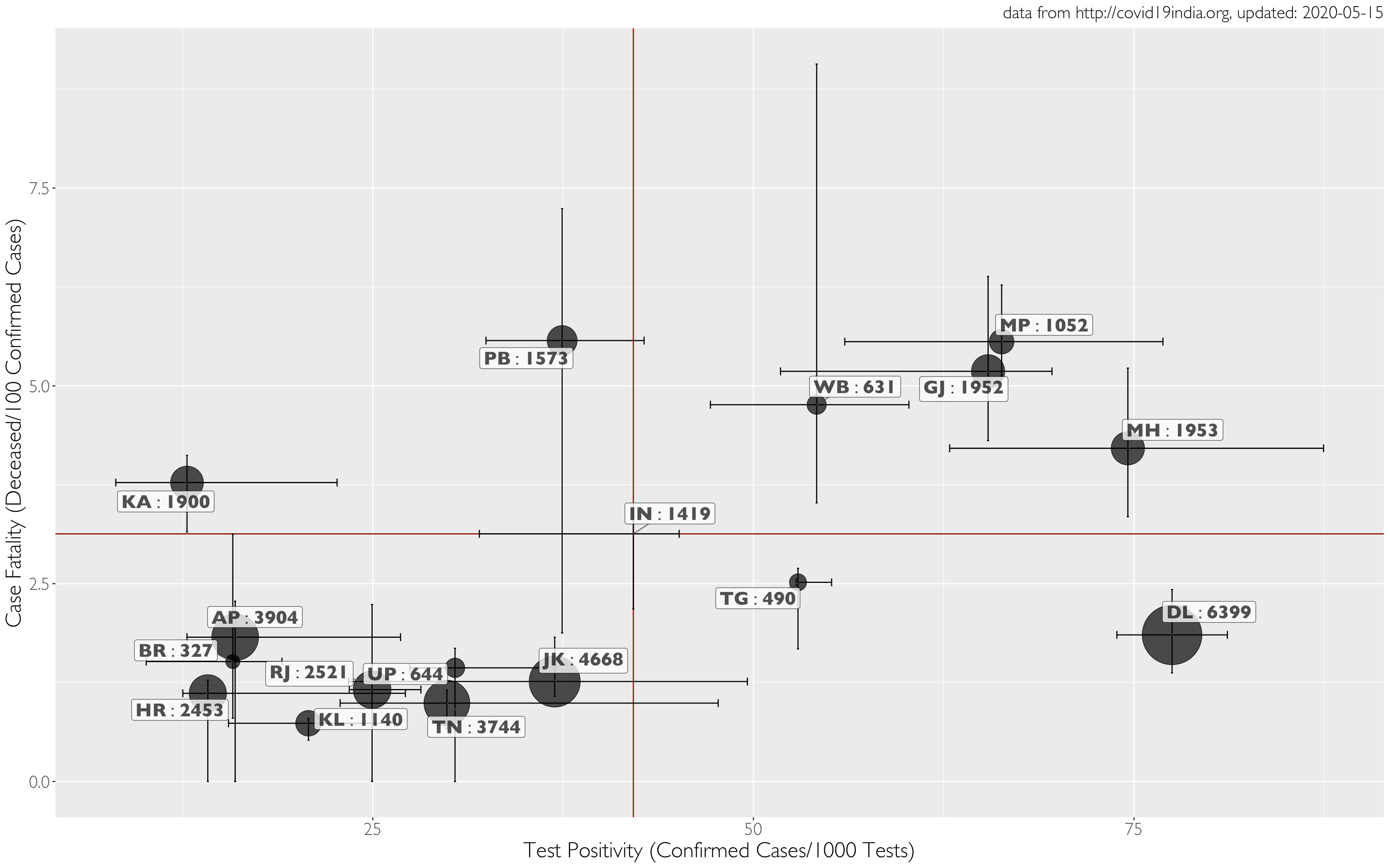
Using data from COVID19India, we assembled a state-wise, cumulative, daily time-series on cases and their progression, and on testing. We then computed the case positivity rate, on the X-axis, as the number of positives detected per thousand tests. The case fatality rate, displayed on the Y-axis, was computed as the ratio of the number of deceased to the number of confirmed cases, and is expressed as a percentage.
The size of the bubbles in the graphs represent the number of tests per million people in the first graph and the cumulative number of deaths in the second, in each state as on May 13. The location of points for each state on the graph is the median of case positivity (X) and case fatality (Y). Given the variation in each state over time, we use error bars along both axes to represent this variation as a 50% interquartile range[footnote]A measure of where the ‘middle 50%’ is in the data[/footnote] around the median.
We also used aggregate data for India to display median values for the country as a whole, shown as dark red horizontal and vertical lines. These lines also break up the plot into four quadrants that help with further interpretation.
Graph 1 shows that states testing at high levels (>3,000 per million, including Delhi, Andhra Pradesh, Tamil Nadu and Jammu & Kashmir) also have lower fatality rates than the national aggregate. However, they differ considerably in their case positivity rates (e.g., Delhi v. Andhra Pradesh). States with lower testing levels have lower case fatality (e.g., Kerala and Uttar Pradesh), and need to be studied further to ensure that there is no underreporting.
The top right quadrant of graph 2 represents high levels of case positivity and case fatality. The size of the bubbles indicates number of deaths.
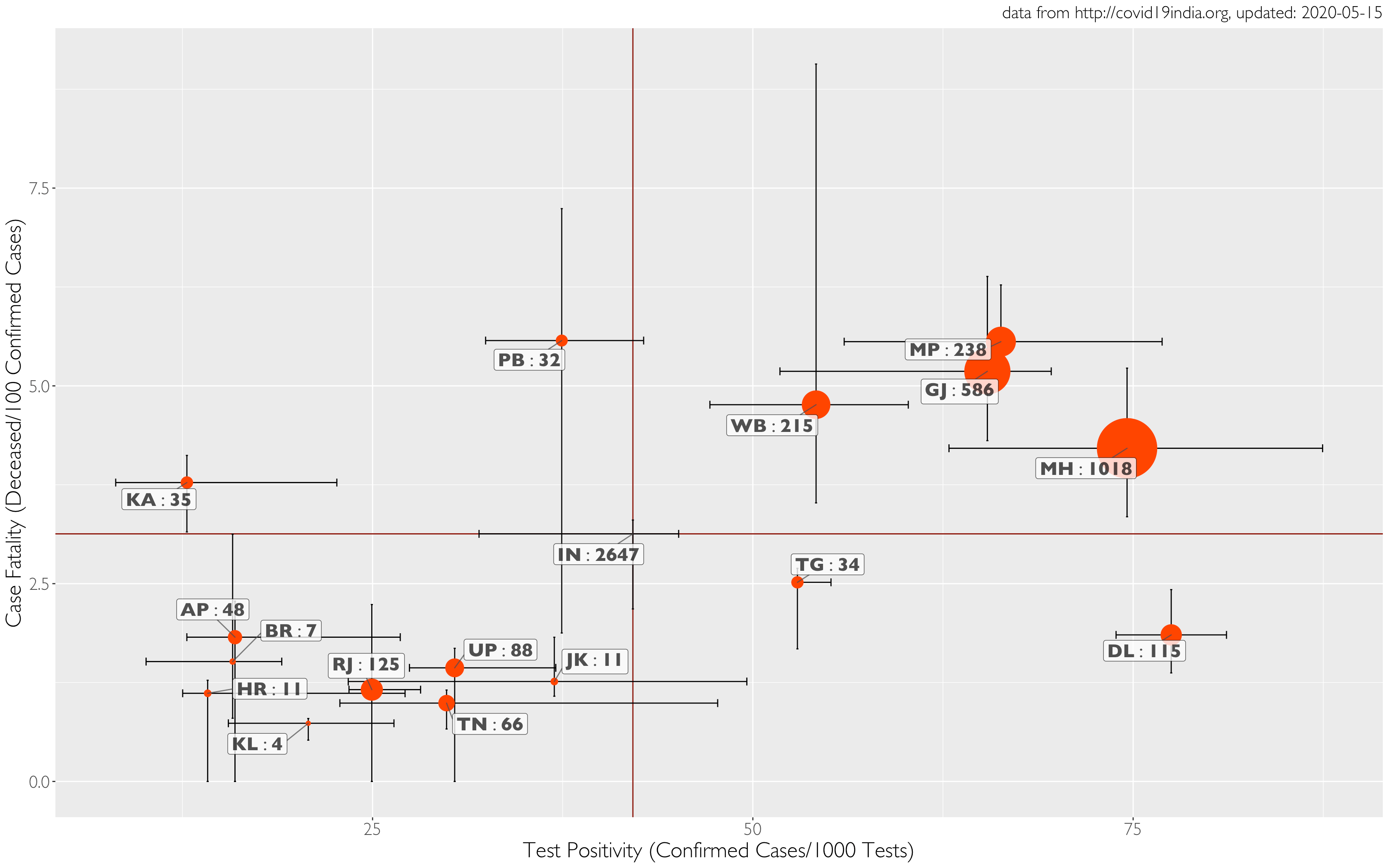
Now, what is common to the largest red bubbles in West Bengal, Gujarat, Madhya Pradesh and Maharashtra? Presumably, these states may have a relatively higher prevalence of COVID-19. Therefore, tests can have a higher probability of coming back positive. The high prevalence may be explained by population density, delayed detection of outbreaks and/or recent influx of people who travelled abroad, leading to the sudden formation of clusters.
The average test positivity in the upper right corner of graph 2 is 65.1 per 1,000 tests, v. 42.1 for India. It could be argued that higher detections may be because of better surveillance, although this may not stand up to scrutiny since these states also have higher case fatalities. Strong surveillance systems generally detect cases earlier, enabling early and timely treatment to prevent a major portion of mortality.
Also read: A Month After Lockdown, COVID-19 Cases Fell in 8 Countries – But Not India
Our assertion based on high case fatality and higher test positivity is that these states are witnessing high transmission, mostly in certain cities. It is important to reduce the mortality by containing further transmission using a more graded relaxation of the lockdown in these states.
On the other hand, the states of Telangana and Delhi seem to be doing well to detect more infected people as a function of testing. However, the lower case fatality in these two cases seems more complicated. One easier explanation is to assume that the infected persons were shifted to hospitals on time and appropriate measures were taken to reduce mortality. However, we cannot rule out underreporting of deaths given that four states with relatively high test positivity are also showing higher case fatality. And it may be hard to argue that the health systems in Telangana and Delhi are way better than those of Maharashtra and Gujarat.
The upper left quadrant, with the states of Karnataka and Punjab, represents the difficult scenario of having lower test positivity but higher case fatality. This is possible when testing is done more randomly – rather than in a targeted matter – and more and more non-infected people are likely being tested. However, a higher case fatality in the presence of lower test positivity in these states also indicates that they may have missed some outbreaks; may have recently received an influx of people with remote access to healthcare facilities and specialised care (e.g. migrant labourers); and may be making poor use of syndrome-based approaches to detect infections.
Finally, the lower left quadrant represents the ideal region of both lower test positivity and lower mortality. This can be possible due to many reasons. First, the outbreak is limited to only a few areas and the state has mounted a good response to contain the disease. Therefore, any increase in the number of tests is not increasing the positivity. The lower mortality in this quadrant is the ideal goal to achieve for the whole country.
Also read: In Photos: The Migrant Labourers of the Industrialised Hinterland
Now, there are limitations in using ecological data. For example, we cannot explain why, among the Empowered Action Group states, Madhya Pradesh’s case fatality is higher than that in Bihar, Uttar Pradesh and Rajasthan. For another, the data from Telangana is quite poor, so meaningful inferences are not possible.
This said, as we prepare to exit the lockdown, it’s time we study these indicators carefully, ensure our surveillance mechanisms work as intended, and decide local actions in each state.
Giridhara R. Babu (@epigiri) and Deepa R. work a the Lifecourse epidemiology unit at the Indian Institute of Public Health, PHFI. M.D. Madhusudan is an independent researcher.
The opinions expressed in this article, based on data in the public domain, are the authors’ own and don’t represent those of any affiliated organisations or bodies.