


Image: Mika Baumeister/Unsplash.
- In 2012, five researchers published three influential studies reporting that dishonesty can be reduced by asking people to sign a statement of honest intent before providing information.
- A larger group of researchers, including the five, attempted to replicate their findings, and their results were published in 2020. They shared the data from both the 2012 and 2020 studies.
- A group of anonymous researchers downloaded this data and found evidence of major fraud in one of the 2012 studies.
This article was first published by DataColada and has been republished here under a Creative Commons Attribution license.
This post is co-authored with a team of researchers who have chosen to remain anonymous. They uncovered most of the evidence reported in this post. These researchers are not connected in any way to the papers described herein.
***
In 2012, Shu, Mazar, Gino, Ariely, and Bazerman published a three-study paper in PNAS (.htm) reporting that dishonesty can be reduced by asking people to sign a statement of honest intent before providing information (i.e., at the top of a document) rather than after providing information (i.e., at the bottom of a document). In 2020, Kristal, Whillans, and the five original authors published a follow-up in PNAS entitled, “Signing at the beginning versus at the end does not decrease dishonesty” (.htm). They reported six studies that failed to replicate the two original lab studies, including one attempt at a direct replication and five attempts at conceptual replications.
Our focus here is on Study 3 in the 2012 paper, a field experiment (N = 13,488) conducted by an auto insurance company in the southeastern United States under the supervision of the fourth author. Customers were asked to report the current odometer reading of up to four cars covered by their policy. They were randomly assigned to sign a statement indicating, “I promise that the information I am providing is true” either at the top or bottom of the form. Customers assigned to the ‘sign-at-the-top’ condition reported driving 2,400 more miles (10.3%) than those assigned to the ‘sign-at-the-bottom’ condition.
The authors of the 2020 paper did not attempt to replicate that field experiment, but they did discover an anomaly in the data: a large difference in baseline odometer readings across conditions, even though those readings were collected long before – many months if not years before – participants were assigned to condition. The condition difference before random assignment (~15,000 miles) was much larger than the analysed difference after random assignment (~2,400 miles):
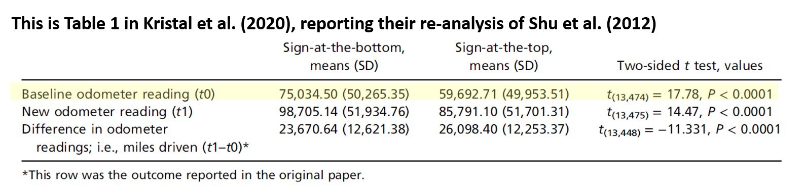
In trying to understand this, the authors of the 2020 paper speculated that perhaps “the randomisation failed (or may have even failed to occur as instructed) in that study” (p. 7104).
On its own, that is an interesting and important observation. But our story really starts from here, thanks to the authors of the 2020 paper, who posted the data of their replication attempts and the data from the original 2012 paper (.htm). A team of anonymous researchers downloaded it, and discovered that this field experiment suffers from a much bigger problem than a randomisation failure: There is very strong evidence that the data were fabricated.
We’ll walk you through the evidence that we and these anonymous researchers uncovered, which comes in the form of four anomalies contained within the posted data file. The original data, as well as all of our data and code, are available on ResearchBox (.htm).
The Data
Let’s start by describing the data file. Below is a screenshot of the first 12 observations [1]:
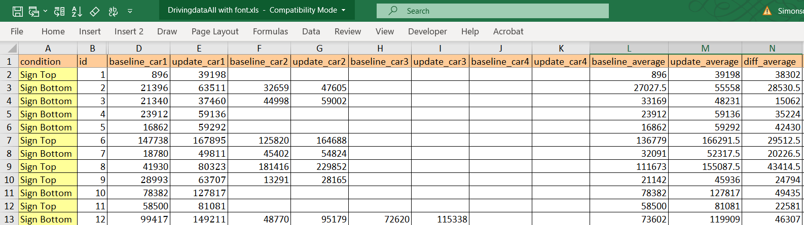
You can see variables representing the experimental condition, a masked policy number, and two sets of mileages for up to four cars. The “baseline_car[x]” columns contain the mileage that had been previously reported for the vehicle x (at Time 1), and the “update_car[x]” columns show the mileage reported on the form that was used in this experiment (at Time 2). The “average” columns report the average mileage of all cars in the row at Time 1 (“baseline_average”) and Time 2 (“update_average”). Finally, the last column (“diff_average”) is the dependent variable analysed in the 2012 paper: It is the difference between the average mileage at Time 2 and the average mileage at Time 1. We will refer to this dependent variable as miles driven.
It is important to keep in mind that miles driven was not reported directly by customers. It was computed by subtracting their Time 1 mileage report, collected long before the experiment was conducted, from their Time 2 mileage report, collected during the experiment.
On to the anomalies.
Anomaly #1: Implausible Distribution of Miles Driven
Let’s first think about what the distribution of miles driven should look like. If there were about a year separating the Time 1 and Time 2 mileages, we might expect something like the figure below, taken from the UK Department of Transportation (.pdf) based on similar data (two consecutive odometer readings) collected in 2010 [2]:
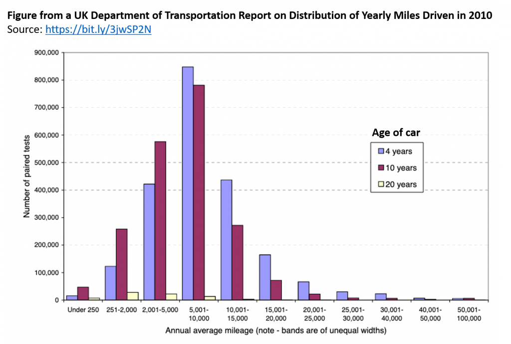
As we might expect, we see that some people drive a whole lot, some people drive very little, and most people drive a moderate amount.
As noted by the authors of the 2012 paper, it is unknown how much time elapsed between the baseline period (Time 1) and their experiment (Time 2), and it was reportedly different for different customers [3]. For some customers the “miles driven” measure may reflect a 2-year period, while for others it may be considerably more or less than that [4]. It is therefore hard to know what the distribution of miles driven should look like in those data. It is not hard, however, to know what it should not look like. It should not look like this:
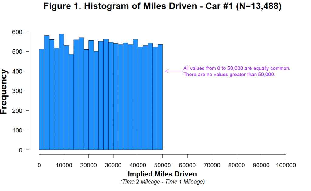
This histogram shows miles driven for the first car in the dataset. There are two important features of this distribution.
First, it is visually and statistically (p=.84) indistinguishable from a uniform distribution ranging from 0 miles to 50,000 miles [5]. Think about what that means. Between Time 1 and Time 2, just as many people drove 40,000 miles as drove 20,000 as drove 10,000 as drove 1,000 as drove 500 miles, etc. [6]. This is not what real data look like, and we can’t think of a plausible benign explanation for it.
Second, you can also see that the miles driven data abruptly end at 50,000 miles. There are 1,313 customers who drove 40,000-45,000 miles, 1,339 customers who drove 45,000-50,000 miles, and zero customers who drove more than 50,000 miles. This is not because the data were winsorised at or near 50,000. The highest value in the dataset is 49,997, and it appears only once. The drop-off near 50,000 miles only makes sense if cars that were driven more than 50,000 miles between Time 2 and Time 1 were either never in this dataset or were excluded from it, either by the company or the authors. We think this is very unlikely [7].
A more likely explanation is that miles driven was generated, at least in part, by adding a uniformly distributed random number, capped at 50,000 miles, to the baseline mileage of each customer (and each car). This is easy to do in Excel (e.g., using RANDBETWEEN(0,50000)).
Why do we think this is what happened?
First, this uniform distribution of miles driven is not only observed for the first car, but for all four cars:
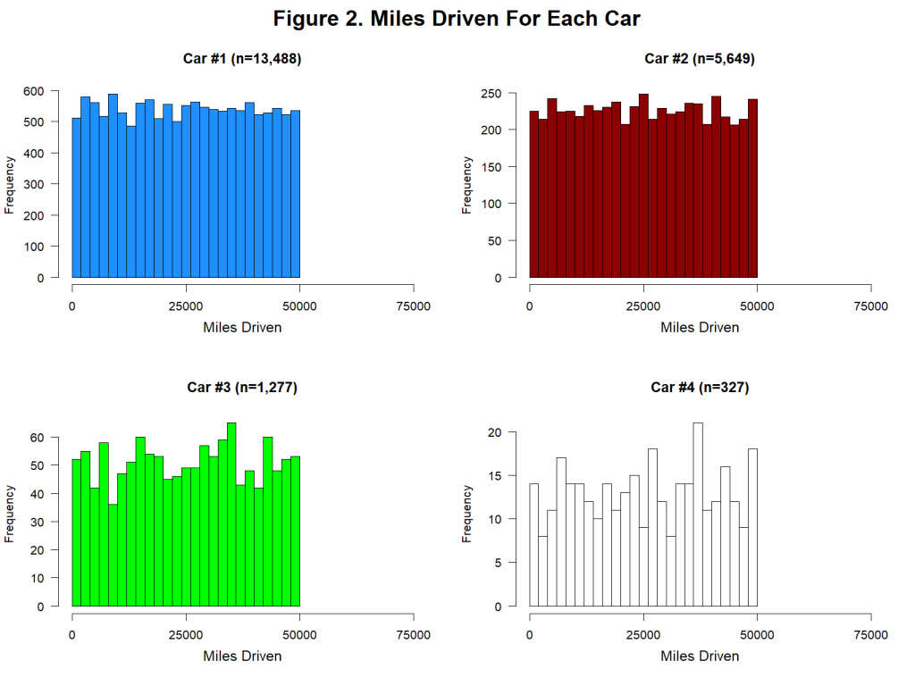
Once again, these distributions are visually and statistically (all ps > .78) consistent with a uniform distribution ranging from 0 to 50,000 miles.
Second, there is some weird stuff happening with rounding…
Anomaly #2: No Rounded Mileages At Time 2
The mileages reported in this experiment were just that: reported. They are what people wrote down on a piece of paper. And when real people report large numbers by hand, they tend to round them. Of course, in this case some customers may have looked at their odometer and reported exactly what it displayed. But undoubtedly many would have ballparked it and reported a round number. In fact, as we are about to show you, in the baseline (Time 1) data, there are lots of rounded values.
But random number generators don’t round. And so if, as we suspect, the experimental (Time 2) data were generated with the aid of a random number generator (like RANDBETWEEN(0,50000)), the Time 2 mileage data would not be rounded.
Let’s first look at the last three digits for every car in the dataset to see how likely people were to report mileages rounded to the nearest thousand (ending in 000) or hundred (ending in 00) [8]:
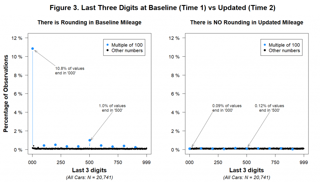
The figure shows that while multiples of 1,000 and 100 were disproportionately common in the Time 1 data, they weren’t more common than other numbers in the Time 2 data. Let’s consider what this implies. It implies that thousands of human beings who hand-reported their mileage data to the insurance company engaged in no rounding whatsoever. For example, it implies that a customer was equally likely to report an odometer reading of 17,498 miles as to report a reading of 17,500. This is not only at odds with common knowledge about how people report large numbers, but also with the Time 1 data on file at the insurance company.
You can also see this if we focus just on the last digit:
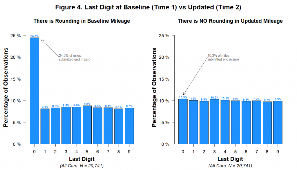
These data are consistent with the hypothesis that a random number generator was used to create the Time 2 data.
In the next section we will see that even the Time 1 data were tampered with.
Interlude: Calibri and Cambria
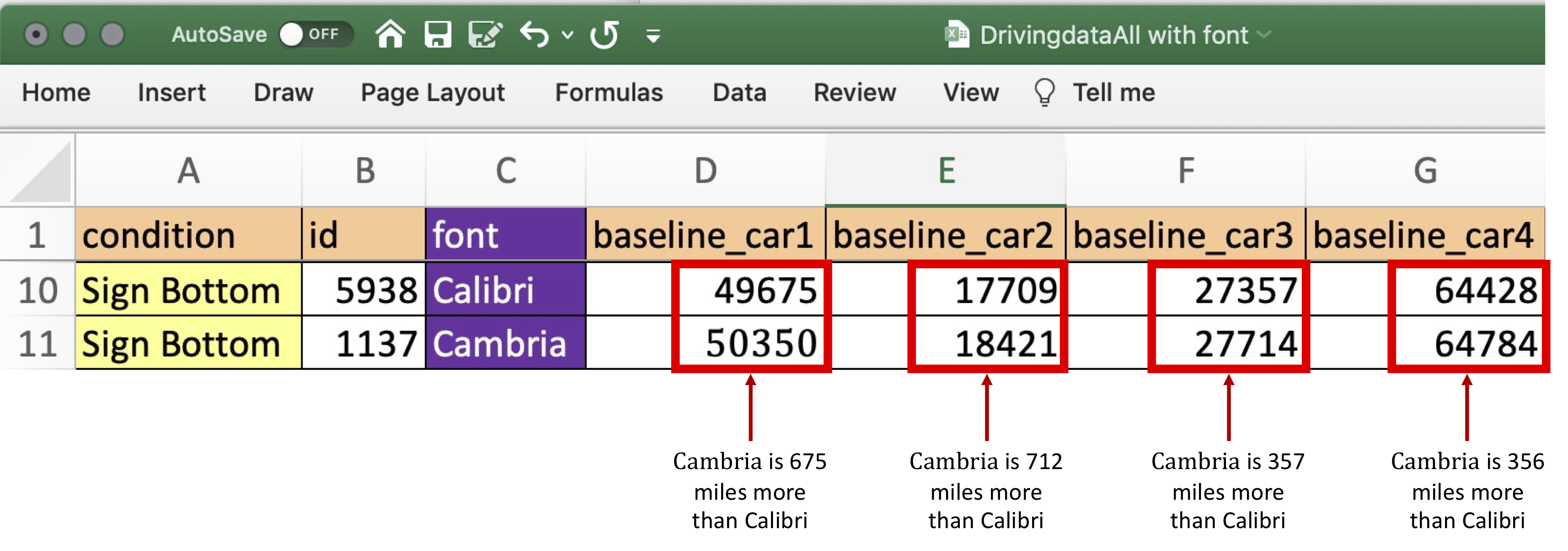
Perhaps the most peculiar feature of the dataset is the fact that the baseline data for Car #1 in the posted Excel file appears in two different fonts. Specifically, half of the data in that column are printed in Calibri, and half are printed in Cambria. Here’s a screenshot of the file again, now with a variable we added indicating which font appeared in that column. The different fonts are easier to spot if you focus on the font size, because Cambria appears larger than Calibri. For example, notice that Customers 4 and 5 both have a 5-digit number in “baseline_car1”, but that the numbers are of different sizes:
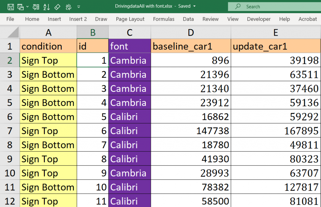
The analyses we have performed on these two fonts provide evidence of a rather specific form of data tampering. We believe the dataset began with the observations in Calibri font. Those were then duplicated using Cambria font. In that process, a random number from 0 to 1,000 (e.g., RANDBETWEEN(0,1000)) was added to the baseline (Time 1) mileage of each car, perhaps to mask the duplication [9].
In the next two sections, we review the evidence for this particular form of data tampering [10].
Anomaly #3: Near-Duplicate Calibri and Cambria Observations
Let’s start with our claim that the Calibri and Cambria observations are near-duplicates of each other. What is the evidence for that?
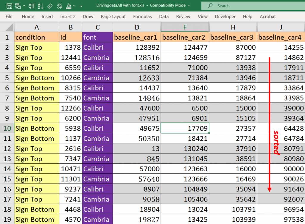
First, the baseline mileages for Car #1 appear in Calibri font for 6,744 customers in the dataset and Cambria font for 6,744 customers in the dataset. So exactly half are in one font, and half are in the other. For the other three cars, there is an odd number of observations, such that the split between Cambria and Calibri is off by exactly one (e.g., there are 2,825 Calibri rows and 2,824 Cambria rows for Car #2).
Second, each observation in Calibri tends to match an observation in Cambria.
To understand what we mean by “match” take a look at these two customers:
The top customer has a “baseline_car1” mileage written in Calibri, whereas the bottom’s is written in Cambria. For all four cars, these two customers have extremely similar baseline mileages. Indeed, in all four cases, the Cambria’s baseline mileage is (1) greater than the Calibri mileage, and (2) within 1,000 miles of the Calibri mileage. Before the experiment, these two customers were like driving twins.
Obviously, if this were the only pair of driving twins in a dataset of more than 13,000 observations, it would not be worth commenting on. But it is not the only pair. There are 22 four-car Calibri customers in the dataset [11]. All of them have a Cambria driving twin: a Cambria-fonted customer whose mileage for all four cars is greater than theirs by less than 1,000 miles. Here are some examples:
Because there are so few policies with four cars, finding these twins requires minimal effort [12]. But there are twins throughout the data, and you can easily identify them for three-car, two-car, and unusual one-car customers, too.
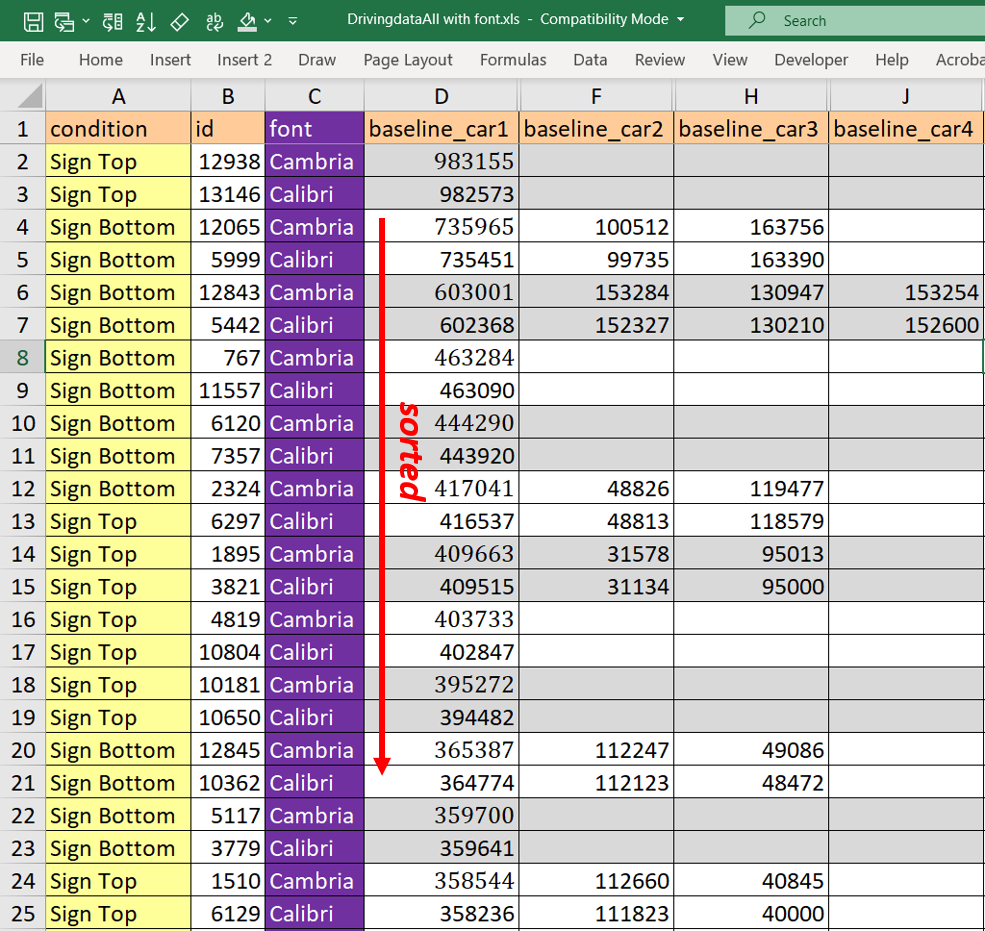
For example, it’s easy to find the twins when you look at customers with extremely high baseline mileage for Car #1. Let’s look at those with Car #1 mileages above 350,000.
There are 12 such policies for Calibri customers in the dataset…and 12 such policies for Cambria customers in the dataset. Once again, each Calibri observation has a Cambria twin whose baseline mileage exceeds it by less than 1,000 miles. This is again true for every car on the policy:
To see a fuller picture of just how similar these Calibri and Cambria customers are, take a look at Figure 5, which shows the cumulative distributions of baseline miles for Car #1 and Car #4. Within each panel, there are two lines, one for the Calibri distribution and one for the Cambria distribution. The lines are so on top of each other that it is easy to miss the fact that there are two of them: 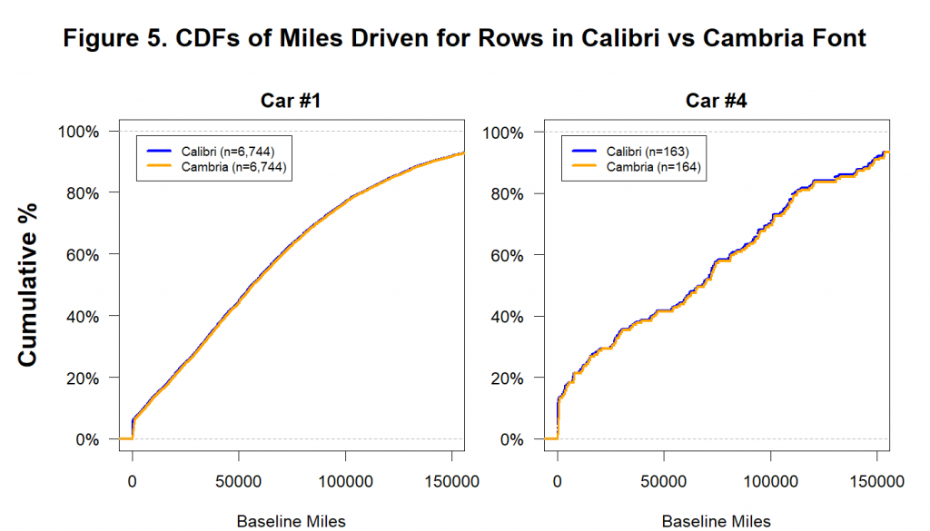
We ran 1 million simulations to determine how often this level of similarity could emerge just by chance. Under the most generous assumptions imaginable, it didn’t happen once. For details, see this footnote: [13].
These data are not just excessively similar. They are impossibly similar.
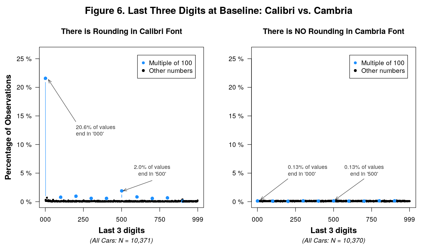
Anomaly #4: No Rounding in Cambria Observations
As mentioned above, we believe that a random number between 0 and 1,000 was added to the Calibri baseline mileages to generate the Cambria baseline mileages. And as we have seen before, this process would predict that the Calibri mileages are rounded, but that the Cambria mileages are not.
This is indeed what we observe:
Conclusion
The evidence presented in this post indicates that the data underwent at least two forms of fabrication: (1) many Time 1 data points were duplicated and then slightly altered (using a random number generator) to create additional observations, and (2) all of the Time 2 data were created using a random number generator that capped miles driven, the key dependent variable, at 50,000 miles.
A single fraudulent dataset almost never provides enough evidence to answer all relevant questions about how that fraud was committed. And this dataset is no exception. First, it is impossible to tell from the data who fabricated it. But because the fourth author has made it clear to us that he was the only author in touch with the insurance company, there are three logical possibilities: the fourth author himself, someone in the fourth author’s lab, or someone at the insurance company. This footnote contains some supporting evidence: [14]. Second, we do not yet know exactly how the data were tampered with in order to produce the condition differences. Were the condition labels generated or altered after the mileage data were created? And we also don’t know the answer to other relevant questions, such as why the Calibri data were duplicated, or why the fabricator(s) generated condition differences at Time 1 [15]. Of course, we don’t need to know the answer to these questions to know that the data were fabricated. We know, beyond any shadow of a doubt, that they were.
We have worked on enough fraud cases in the last decade to know that scientific fraud is more common than is convenient to believe, and that it does not happen only on the periphery of science. Addressing the problem of scientific fraud should not be left to a few anonymous (and fed up and frightened) whistleblowers and some (fed up and frightened) bloggers to root out. The consequences of fraud are experienced collectively, so eliminating it should be a collective endeavor. What can everyone do?
There will never be a perfect solution, but there is an obvious step to take: Data should be posted. The fabrication in this paper was discovered because the data were posted. If more data were posted, fraud would be easier to catch. And if fraud is easier to catch, some potential fraudsters may be more reluctant to do it. Other disciplines are already doing this. For example, many top economics journals require authors to post their raw data [16]. There is really no excuse. All of our journals should require data posting.
Until that day comes, all of us have a role to play. As authors (and co-authors), we should always make all of our data publicly available. And as editors and reviewers, we can ask for data during the review process, or turn down requests to review papers that do not make their data available. A field that ignores the problem of fraud, or pretends that it does not exist, risks losing its credibility. And deservedly so.
Author Feedback
We contacted all authors of the 2012 and 2020 paper, inviting them to provide feedback on earlier drafts of this post and to post responses to it. In response to feedback, we made a few minor edits to the post. In addition, four of the authors of the original paper asked us to post responses here: Nina Mazar (.pdf), Francesca Gino (.pdf), Dan Ariely (.pdf), and Max Bazerman (.pdf).
Footnotes
- To make things easier to understand, we have changed the variable names from what they were in the original posted file.
- We added the “Age of car” legend title.
- The authors wrote that “miles driven per car have been accumulated over varying unknown time periods” (p. 15200).
- As the authors of the 2012 paper point out, the average reported mileage amount per car in this study (about 25,000 miles) is about twice what the average American typically drives in a single year (p. 15198).
- The reported p=.84 comes from a Kolmogorov-Smirnov test comparing the miles driven data to a uniform distribution ranging from 0-50,000.
- For example, for Car #1 there are 115 customers who drove between 0-500 miles, 136 between 5,000-5,500 miles, 134 between 10,000-10,500 miles, and 126 between 49,500-50,000 miles.
- First, the authors of the 2012 paper did not report any such exclusions. Second, it seems very strange for a company to drop or exclude customers who reported driving more than 50,000 miles on any one car, but to retain those who reported driving much more than 50,000 miles across their many cars. This is even stranger since the time elapsed between Time 1 and Time 2 varied across customers, for it would mean, for example, that a customer who reported driving more than 50,000 over three years would be dropped while a customer who reported driving 49,998 miles over 1 year would not be dropped. It doesn’t seem plausible that a company would do this.
- These results are the same if we look at each of the four cars separately.
- And as discussed above, we believe that for all observations, a separate random number of up to 50,000 was added to create the Time 2 data for each car.
- It is also worth noting that all of the Time 2 mileages for Car #1 appear in Cambria font as well. Except for the two columns containing mileages for Car #1, everything else in the dataset is in Calibri font.
- You might be wondering, “Wait, how come you are now saying there are only 44 four-car customers in the dataset when just before this you showed that there are 327 observations for Car #4?” Thanks for being so attentive. It turns out that many customers have reported mileage for Car #4 without having four cars. That is, they have values for Car #4, but not for Car #2 and/or Car #3.
- Simply sorting policies with four cars by the number of miles reported in “baseline_car4” leads to an almost perfectly interleaved set of twins, as 20 of the 22 pairs appear in adjacent rows. The remaining two pairs of twins are separated by just one row.
- To more formally examine just how unusual this level of similarity is, we focused on Car #4, as smaller numbers of observations give us greater power to detect impossible similarity. (As an intuition, consider that two *infinitely* sized samples drawn from the same population will be identical.) We then conducted some simulations, in which we used the most conservative procedure we could think of for assigning font to observations. Specifically, we drew observations at random, sorted them by miles, and assigned even rows to Cambria and odd rows to Calibri, maximising the similarity between fonts (in the consecutive sorted rows). We then determined whether these simulated Cambria and Calibri fonts were as similar as those in the posted data. We ran 1 million such simulations. Zero of them produced as much similarity between fonts as there is in the posted data (for even more details see .htm).
- The properties of the Excel data file analysed here, and posted online as supporting materials by Kristal et al. (2020), shows Dan Ariely as the creator of the file and Nina Mazar as the last person to modify it. On August 6, 2021, Nina Mazar forwarded us an email that she received from Dan Ariely on February 16, 2011. It reads, “Here is the file”, and attaches an earlier version of that Excel data file, whose properties indicate that Dan Ariely was both the file’s creator and the last person to modify it. That file that Nina received from Dan largely matches the one posted online; it contains the same number of rows, the two different fonts, and the same mileages for all cars. There were, however, two mistakes in the data file that Dan sent to Nina, mistakes that Nina identified. First, the effect observed in the data file that Nina received was in the opposite direction from the paper’s hypothesis. When Nina asked Dan about this, he wrote that when preparing the dataset for her he had changed the condition labels to be more descriptive and in that process had switched the meaning of the conditions, and that Nina should swap the labels back. Nina did so. Second, and more trivially, the Excel formula used for computing the difference in mileage between the two odometer readings was missing in the last two rows. Nina corrected that as well. We have posted the file that Nina sent us on ResearchBox.org/336. It is worth noting that the names of the other three authors – Lisa Shu, Francesca Gino, and Max Bazerman – do not appear on the properties of either Excel file.
- If anyone figures out the answers to any of these questions, please reach out to let us know. Our ResearchBox includes appendices documenting some of our other thoughts and findings relevant to this.
- While allowing exceptions in rare cases in which this is impossible.
Uri Simonsohn is a professor of behavioural science, ESADE Business School, Barcelona. Leif Nelson is a professor of business administration and marketing, Haas School of Business, University of California Berkeley. Joseph Simmons is a professor of operations, information and decisions, Wharton School of Business, University of Pennsylvania.